Developer Center - Unified Experience
KX’s developer documentation was scattered across 4 separate sites, causing slow onboarding and high drop-off. I helped design a single, unified Developer Center that consolidated all docs, guides, and tools into one experience. Shipped October 2025
KX’s developer documentation was scattered across 4 separate sites, causing slow onboarding and high drop-off. I helped design a single, unified Developer Center that consolidated all docs, guides, and tools into one experience.
Shipped October 2025
Software & Tech
Team of 4
6 months
The Challenge
Developers relied on few disconnected documentation sites, with no shared navigation, search, or onboarding flow. New developers couldn't find a "Step 1," and experienced users wasted time jumping between portals. The result: slow adoption and early drop-off.
Design Goal
Design a single Developer Center that gives new users a clear starting path and gives experienced users fast access to a deep documentation - reducing time-to-first-action for both audiences.
Outcome
Consolidated 4 legacy sites into one Developer Center, reducing estimated time-to-first-code-example from 15 minutes to under 5mins and onboarding support questions by 45%.
My Role
Product Designer on a cross-functional team with Product and Engineering. I led research and testing - card sorting, content mapping, and a Maze usability study - translating findings into actionable recommendations. I also designed the navigation and key screens and handed off to engineering with detailed Figma annotations.
User Research
Card Sorting
Data Synthesis
Usability Testing
Prototyping
Design Handoff
Challenge
Developers relied on few disconnected documentation sites, with no shared navigation, search, or onboarding flow. New developers couldn’t find a “Step 1,” and experienced users wasted time jumping between portals. The result: slow adoption and early drop-off.
Design Goal
Design a single Developer Center that gives new users a clear starting path and gives experienced users fast access to deep documentation - reducing time-to-first-action for both audiences.
Outcome
Consolidated 4 legacy sites into one Developer Center, reducing estimated time-to-first-code-example from 15 minutes to under 5mins and onboarding support questions by 45%.
My Role
Product Designer on a cross-functional team with Product and Engineering. I synthesized developer interview insights, led the IA work (card sorting, content mapping), ran the Maze usability study, designed the navigation menu and supporting screens, contributed to the product overview IA, audited accessibility with Stark, and handed off my designs to engineering with detailed Figma annotations.
User Research
UX/UI
Prototyping
Wireframing
Usability Testing
Design Handoff
Results
Impact and Outcomes
~ 70%
reduction in time-to-first-code- example
From 15 min to under 5min
4 → 1
fragmented documentation sites unified into a single hub
Launched October 2025.
~ 45%
reduction in onboarding-related support questions
Less confusion
Phase 01
Experience Before
Developers were contacting support for answers that already existed in the docs - they just couldn't find them. With documentation spread across 4 separate sites, each with its own navigation and search, even simple tasks required jumping between portals.
Fragmentation
4 Sites
No shared navigation
Time to Hello World
~ 15min
To first code example
Competitive pressure
High
Developer docs falling behind industry standard
Decision Rationale
Why Not Just Connect the Existing Sites?
Stakeholders initially considered adding shared navigation across existing sites, but our research showed the problem ran deeper than navigation.
The problem wasn't navigation - it was that developers had to relearn the interface every time they switched sites. Connecting the sites wouldn't fix that. Only rebuilding as one experience would.
1
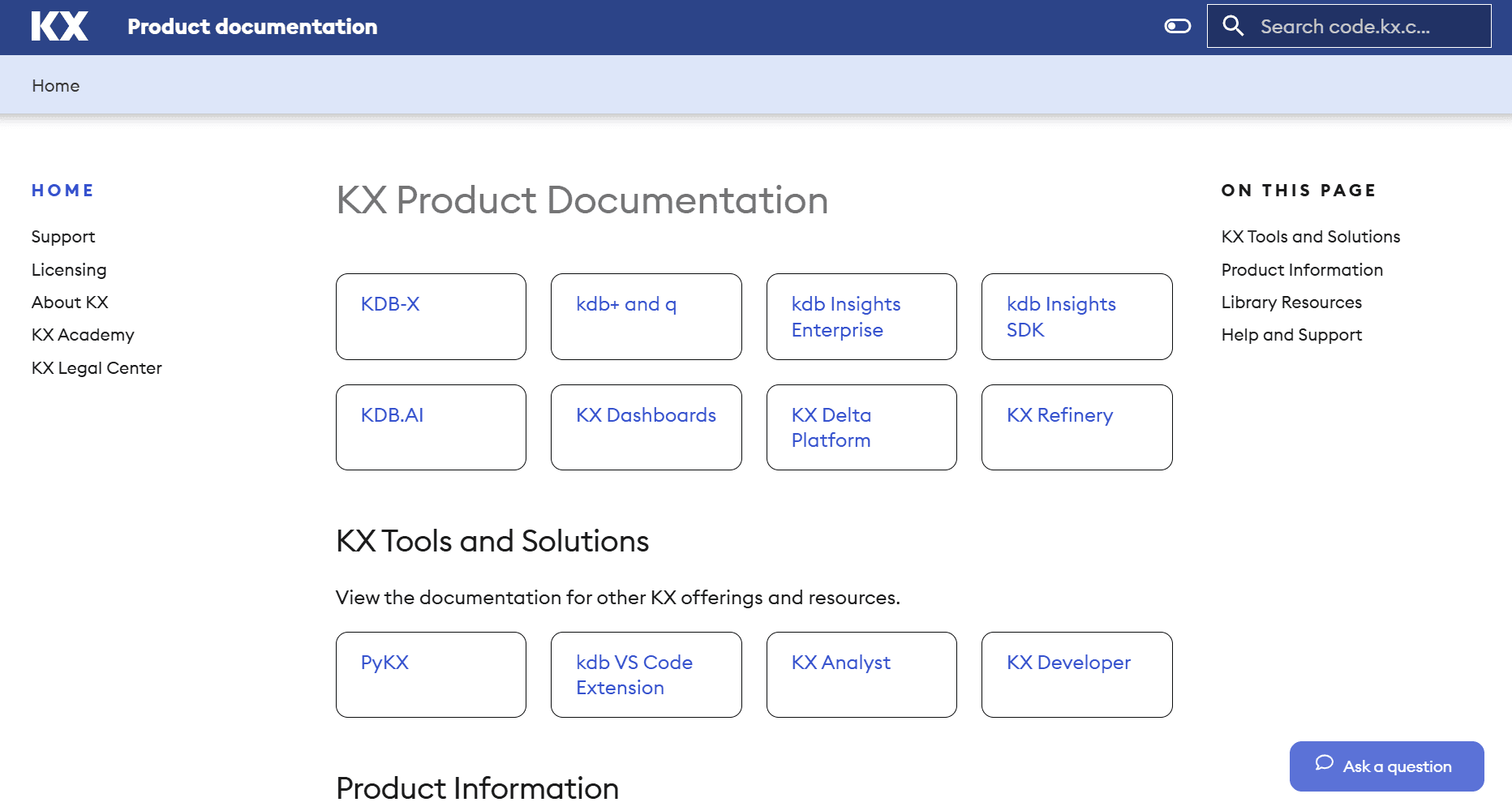
code.kx.com/home/index.html
Product docs hub - dense text, no onboarding
2
docs.kx.com/home/index.htm
Enterprise docs - separate nav, different visual style
3
kx.com/developers/developer-tools/
Developer marketing page - no code examples
4
code.kx.com/q/
kdb+/q docs - isolated from other products
Phase 02
Experience After
One hub, one navigation, one search - from 4 scattered sites to a single Developer Center.
What the new experience delivers:
4 sites → 1 unified platform with shared search
Task-based navigation validated by card sorting with 15 devs
15 min → under 5min to first code example
Segmented paths for new users and experienced users

Results
Impact and Outcomes
70%
reduction in time-to-first-code- example
From 15 min to under 5min
4 → 1
fragmented documentation sites unified into a single hub
Launched October 2025.
45%
reduction in onboarding-related support questions
Less confusion
70%
reduction in time-to-first-code- example
From 15 min to under 5min
4 → 1
fragmented doc sites unified into a single hub
Launched
October 2025
45%
reduction in onboarding-related support questions
Less confusion
~ 70%
~ 70%
reduction in time-to-first-code- example
From 15 min to under 5min
4 → 1
4 → 1
fragmented documentation sites unified into a single hub
Launched October 2025.
~ 45%
~ 45%
reduction in onboarding-related support questions
Less confusion
Phase 01
Experience Before
Developers were contacting support for answers that already existed in the docs - they just couldn't find them. With documentation spread across 4 separate sites, each with its own navigation and search, even simple tasks required jumping between portals.
Fragmentation
4 Sites
No shared navigation
Time to Hello World
~ 15min
To first code example
Competitive pressure
High
Developer docs falling behind industry standard
Fragmentation
4 Sites
No shared navigation
Time to Hello World
~ 15min
To first code example
Competitive pressure
High
Developer docs falling behind industry standard
Decision Rationale
Why Not Just Connect the Existing Sites?
Stakeholders initially considered adding shared navigation across existing sites, but our research showed the problem ran deeper than navigation.
The problem wasn't navigation - it was that developers had to relearn the interface every time they switched sites. Connecting the sites wouldn't fix that. Only rebuilding as one experience would.
1
code.kx.com/home/index.html
Product docs hub - dense text, no onboarding
2
docs.kx.com/home/index.htm
Enterprise docs - separate nav, different visual style
3
kx.com/developers/developer-tools/
Developer marketing page - no code examples
4
code.kx.com/q/
kdb+/q docs - isolated from other products
1
code.kx.com/home/index.html
Product docs hub - dense text, no onboarding
2
docs.kx.com/home/index.htm
Enterprise docs - separate nav, different visual style
3
kx.com/developers/developer-tools/
Developer marketing page - no code examples
4
code.kx.com/q/
kdb+/q docs - isolated from other products
1
code.kx.com/home/index.html
Product docs hub - dense text, no onboarding
2
docs.kx.com/home/index.htm
Enterprise docs - separate nav, different visual style
3
kx.com/developers/developer-tools/
Developer marketing page - no code examples
4
code.kx.com/q/
kdb+/q docs - isolated from other products
Phase 02
Experience After
One hub, one navigation, one search - from 4 scattered sites to a single Developer Center.
What the new experience delivers:
15 min → under 5min to first code example
4 sites → 1 unified platform with shared search
Task-based navigation organized by workflow instead of product-based site structure.
Separate paths for beginners and power users instead of one-size-fits-all
4 sites → 1 unified platform with shared search
Task-based navigation organized by workflow instead of product-based site structure.
Task-based navigation organized by workflow instead of product-based site
15 min → under 5min to first code example
15 min → under 5min to first code example
Separate paths for beginners and power users instead of one-size-fits-all
Research
Understanding the Users
How I Gathered Insights
Focus Group Interviews
I synthesized feedback from developer focus group interviews to identify recurring pain points around onboarding clarity, content organization, and differences between new and experienced users.
These insights helped prioritize which problems required design intervention and informed how content should be structured.
Questions we asked:
“What do you usually look for when starting with a new tool?”
“What makes a developer experience feel frustrating?”

Research Challenge
"The loudest voice isn't always the most representative."
In early focus groups, one participant consistently dominated the conversation. Quieter developers ( often the ones struggling most ) weren't speaking up. So I pivoted to 1:1 interviews, and that's when the real pain points surfaced.
Core Interview Finding
"The biggest friction point is the lack of a clear 'Step 1' - I want to feel guided, not lost in documentation."
📊 Maze Study
To validate and quantify qualitative themes, I ran a Maze survey with 9 participants to assess expectations, usability gaps, and content priorities.

83%
New users prioritize guided onboarding
First time users said onboarding were top-priority, confirming the need for a clear starting point

Experienced users value depth and efficiency
Advanced users focused on deeper admin and support content, signaling need for segmented pathways.

Card sorting & Information Architecture
Ran a card sorting exercise to understand how users naturally group content. This helped design the experience based on how users think, not our assumptions.
15 Participants
Open sort
60+ content items
Key Insights & Patterns
“I group things by workflow - setup, build, deploy.”
“I’m thinking about the task I need to complete, not which product it belongs to.”
“Product categories don’t help me when I’m trying to solve something.”
Task-Based Grouping
Users grouped content by workflow and goals - not internal product structure.
“I need a clear ‘start here’ section.”
“If I’m new, I don’t want to dig for the first step.”
“I just want to know what to do first.”
Clear Entry Points Needed
New users consistently clustered onboarding and setup together, suggesting a dedicated "First Experience" zone in the primary navigation.
“Let me jump straight to trouble
shooting.”
“Advanced docs should be separate from beginner guides.”
“If I’m stuck, I want the answer fast.”
Efficiency for Advanced Users
Experienced developers grouped troubleshooting and optimization content separately, valuing speed of lookup over linear narrative flow.
Research
Understanding the Users
How I Gathered Insights
Focus Group Interviews
I synthesized feedback from 8 developer focus group interviews to identify recurring pain points around onboarding clarity, content organization, and differences between new and experienced users.
These insights helped prioritize which problems required design intervention and informed how content should be structured.
Questions we asked:
“What do you usually look for when starting with a new tool?”
“What makes a developer experience feel frustrating?”
Research Challenge
"The loudest voice isn't always the most representative."
In early focus groups, one participant consistently dominated the conversation. Quieter developers ( often the ones struggling most ) weren't speaking up. So I pivoted to 1:1 interviews, and that's when the real pain points surfaced.
Focus Group Interviews
The plan was to conduct 8 focus group interviews ( with 4 users in each group) to identify onboarding friction, content clarity gaps, and differences between new and experienced users.
However, I faced the challenge and decided to continue with 1:1 interviews instead.
Questions we asked:
“What do you usually look for when starting with a new tool?”
“What makes a developer experience feel frustrating?”
Focus Group Interviews
Synthesized feedback from 8 developer focus groups to identify onboarding friction, content clarity gaps, and differences between new and experienced users.
Insights informed content prioritization and information architecture decisions.
Research Challenge
"The loudest voice isn't always the most representative."
In early focus groups, one participant consistently dominated the conversation. Quieter developers ( often the ones struggling most ) weren't speaking up. So I pivoted to 1:1 interviews, and that's when the real pain points surfaced.
Core Interview Finding
"The biggest friction point is the lack of a clear 'Step 1' - I want to feel guided, not lost in documentation."
📊 Maze Study
To validate qualitative insights, I ran a Maze survey with 9 participants to assess onboarding expectations and content priorities.
📊 Maze Study
To validate qualitative insights, I ran a Maze survey with 9 participants to assess onboarding expectations and content priorities.
83%
New users prioritize guided onboarding
Confirmed the need for a clear starting point on the homepage.
Experienced users value depth and efficiency
Highlighted the need for segmented pathways and advanced documentation.
83%
New users prioritize guided onboarding
Experienced users value depth and efficiency
📊 Maze Study
To validate and quantify qualitative themes, I ran a Maze survey with 9 participants to assess expectations, usability gaps, and content priorities.
Core Interview Finding
"The biggest friction point is the lack of a clear 'Step 1' - I want to feel guided, not lost in documentation."
How I Gathered Insights

Research Challenge
"The loudest voice isn't always the most representative."
In early focus groups, one participant consistently dominated the conversation. Quieter developers ( often the ones struggling most ) weren't speaking up. So I pivoted to 1:1 interviews, and that's when the real pain points surfaced.
Focus Group Interviews
I synthesized feedback from 8 developer focus group interviews to identify recurring pain points around onboarding clarity, content organization, and differences between new and experienced users.
These insights helped prioritize which problems required design intervention and informed how content should be structured.
Questions we asked:
“What do you usually look for when starting with a new tool?”
“What makes a developer experience feel frustrating?”
Card Sorting & Information Architecture
I ran a card sorting exercise to understand how users naturally group content. This helped design the experience based on how users think, not our assumptions.
15 Participant
Open sort
40+ items
15 Participants
Open sort
60+ content items
“I group things by workflow - setup, build, deploy.”
“I’m thinking about the task I need to complete, not which product it belongs to.”
“Product categories don’t help me when I’m trying to solve something.”
Task-Based Grouping
Users grouped content by workflow and goals - not internal product structure.
“I need a clear ‘start here’ section.”
“If I’m new, I don’t want to dig for the first step.”
“I just want to know what to do first.”
Clear Entry Points Needed
New users consistently clustered onboarding and setup together, suggesting a dedicated "First Experience" zone in the primary navigation.
“Let me jump straight to trouble
shooting.”
“Advanced docs should be separate from beginner guides.”
“If I’m stuck, I want the answer fast.”
Efficiency for Advanced Users
Experienced developers grouped troubleshooting and optimization content separately, valuing speed of lookup over linear narrative flow.
Key Insights & Patterns
“I group things by workflow - setup, build, deploy.”
“I’m thinking about the task I need to complete, not which product it belongs to.”
“Product categories don’t help me when I’m trying to solve something.”
Task-Based Grouping
Users grouped content by workflow and goals, not internal product structure.
“I need a clear ‘start here’ section.”
“If I’m new, I don’t want to dig for the first step.”
“I just want to know what to do first.”
Clear Entry Points Needed
New users consistently clustered onboarding and setup together, suggesting a dedicated "First Experience" zone in the primary navigation.
“Let me jump straight to trouble
shooting.”
“Advanced docs should be separate from beginner guides.”
“If I’m stuck, I want the answer fast.”
Efficiency for Advanced Users
Experienced developers grouped troubleshooting and optimization content separately, valuing speed of lookup over linear flow.
Design & Test
Prototypes & Validation
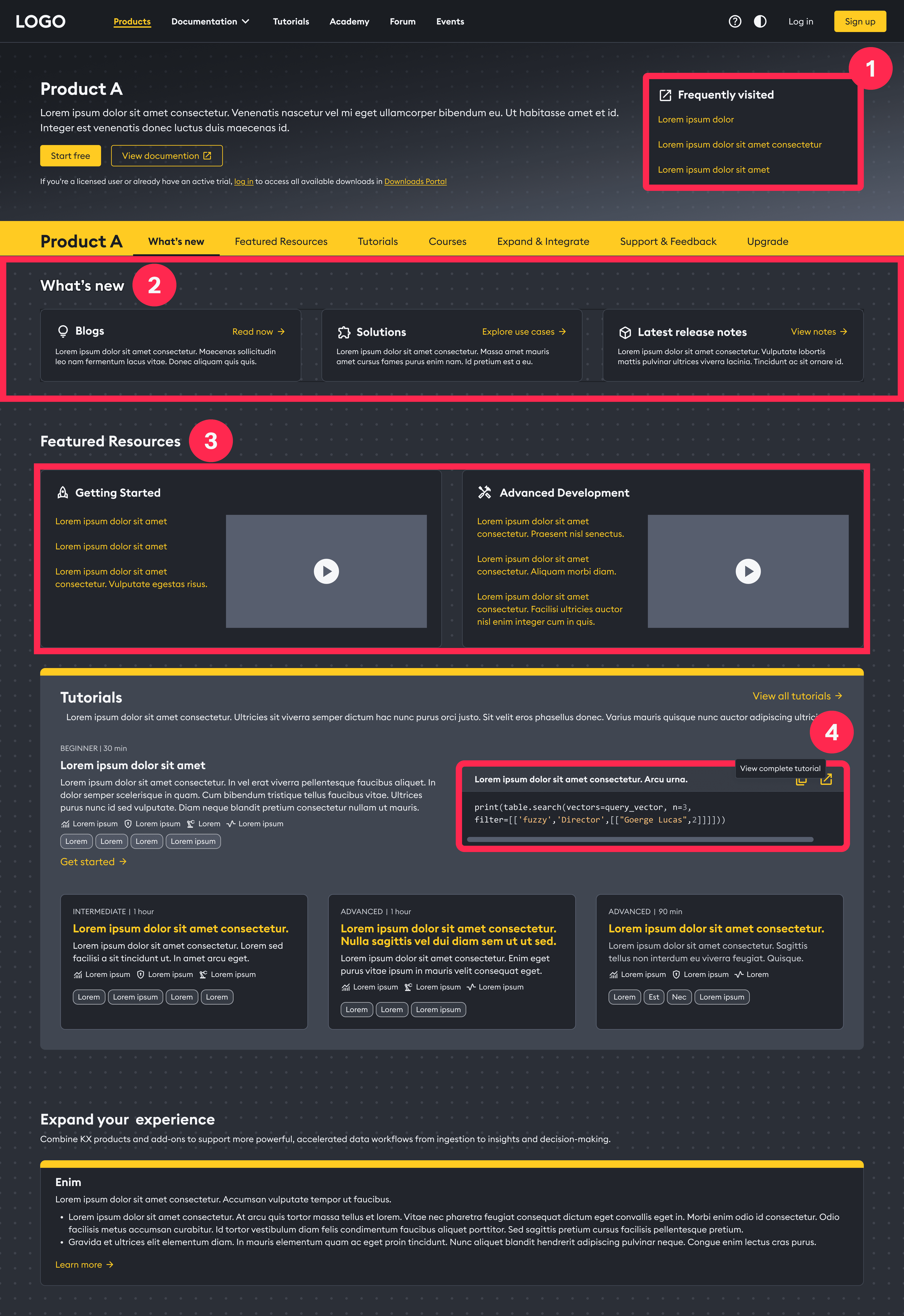
Site Navigation
First concept separated “Products” and “Documentation” into two menus, however usability testing showed developers expected docs to live next to the product they were using. I merged them into a single “Product & Docs” dropdown, grouping each product with its documentation and adding clear action labels (“Explore” / “Documentation”).
First concept separated “Products” and “Documentation” into two menus, however usability testing showed developers expected docs to live next to the product they were using. I merged them into a single “Product & Docs” dropdown, grouping each product with its documentation and adding clear action labels (“Explore” / “Documentation”).
First Concept
Fragmented navigation with separated menus for "Products" and "Documentation"
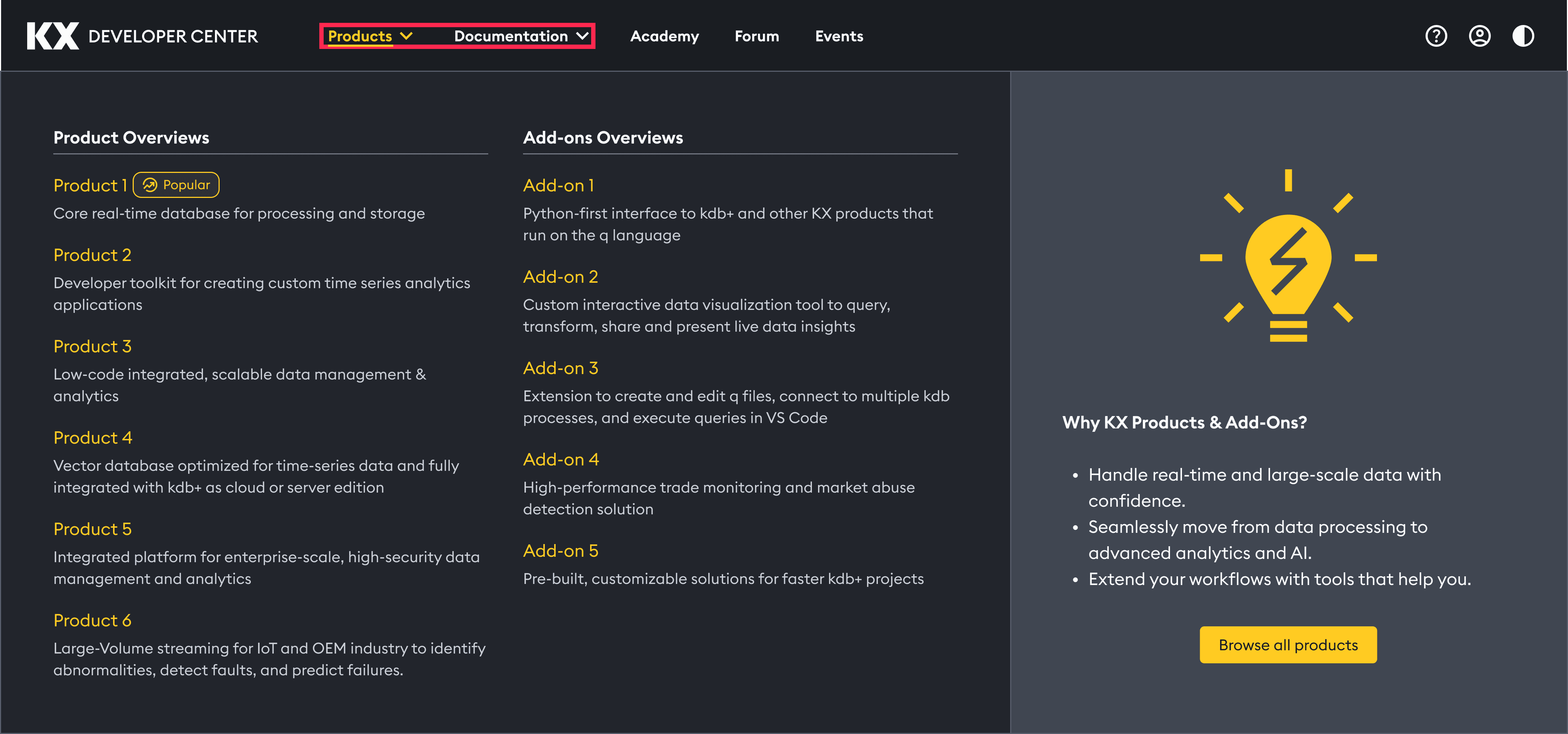
After Research
Unified "Product & Docs" hierarchy to improve discoverability and reduce cognitive load.
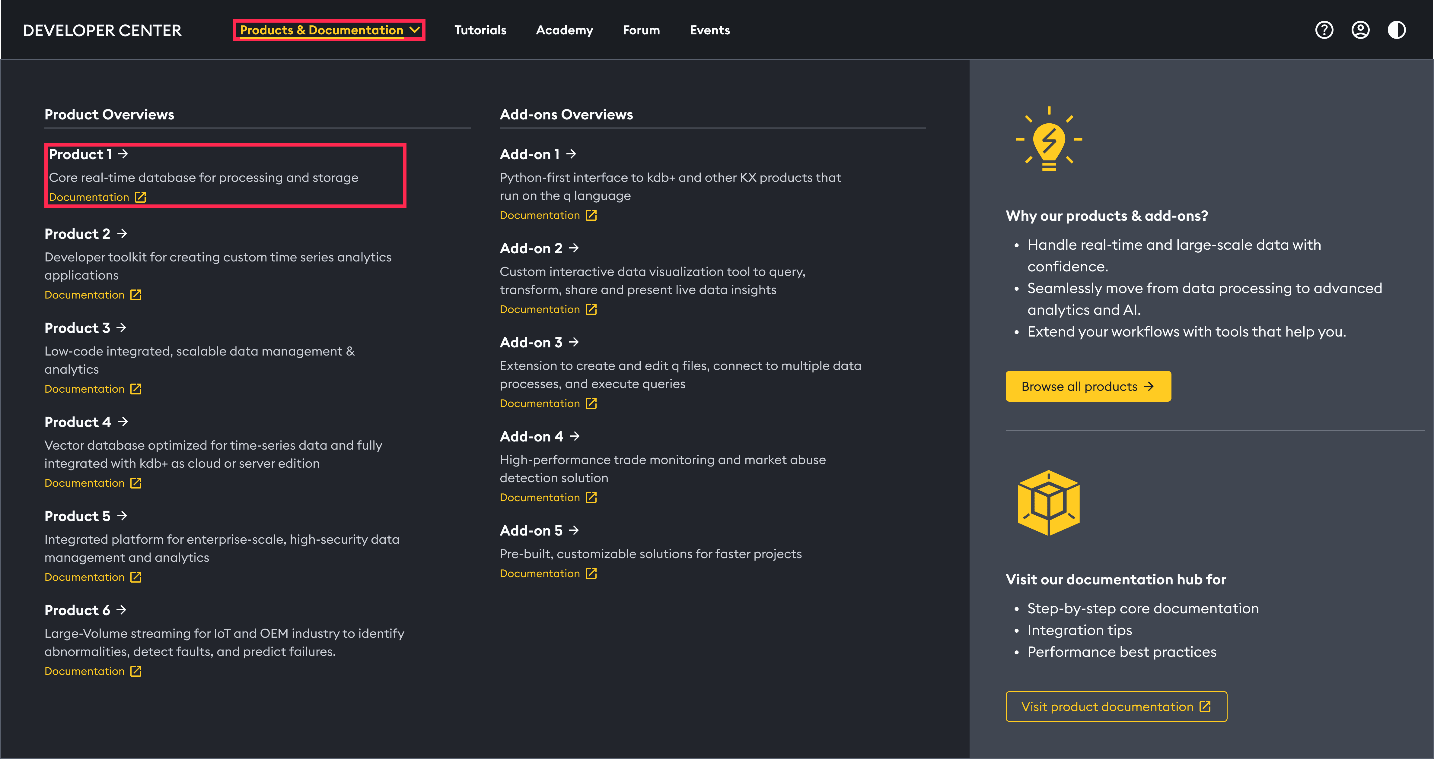
I conducted Maze A/B test, which showed that Variant B was the winner.
I conducted Maze A/B test, which showed that Variant B was the winner.

Product Overview Page
The first concept product page had no clear entry point - developers had to scan mixed-level docs before taking any action. I recommended to redesigned it with four key changes and validated it through usability testing with developers across experience levels.
First Concept
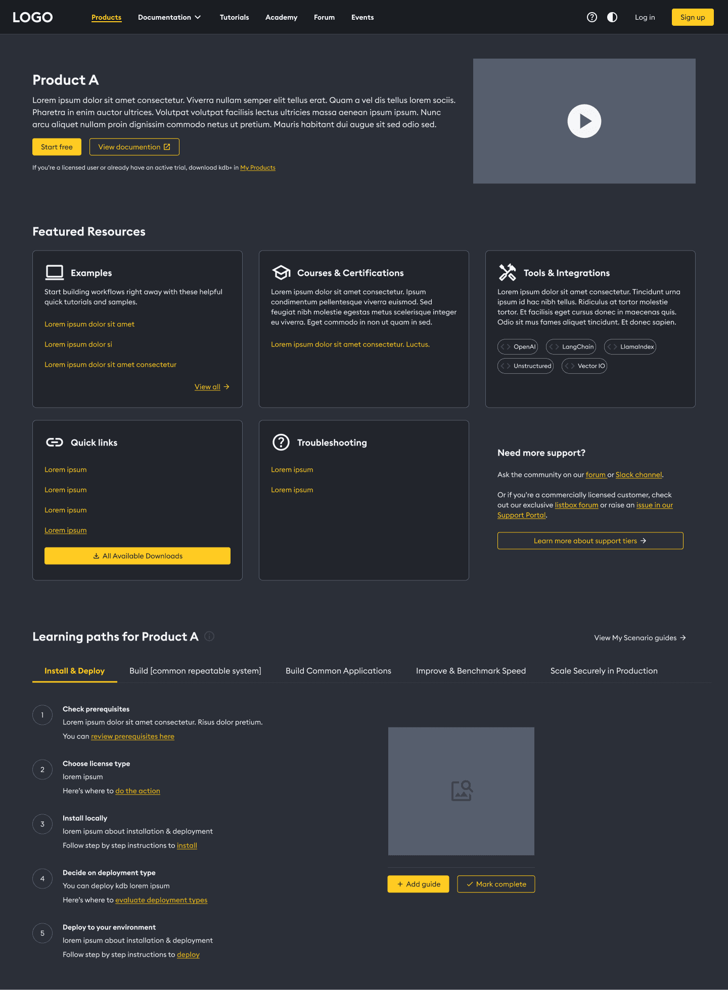
💡 The original interface lacked a clear entry point, forcing developers to scan through mixed-level documentation before taking their first action.
After Research
First Concept
💡 The original interface lacked a clear entry point, forcing developers to scan through mixed-level documentation before taking their first action.
After Research
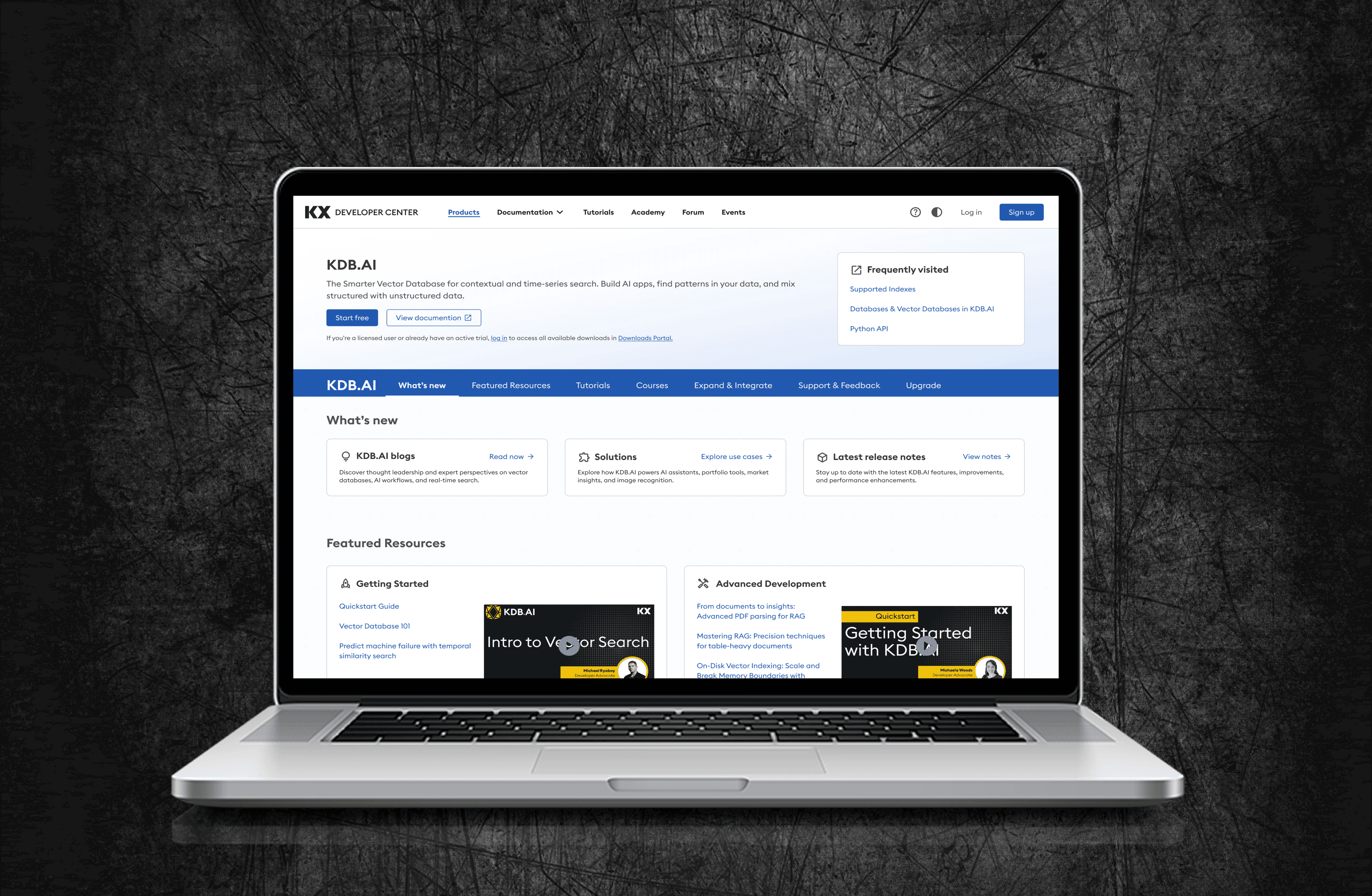
Added 'Frequently Visited' links
Before: Users had to dig through menus.
Impact: Faster daily navigation.
New 'What’s New' hub
Before: No clear path for developers.
Impact: Easier for new users.
Separated beginner & advanced flows
Before: Mixed content caused confusion.
Impact: Efficient for all users.
One-click code copy
Before: Examples were hard to copy.
Impact: Faster testing and deployment.
First Concept
Added 'Frequently Visited' links
Before: Users had to dig through menus.
Impact: Faster daily navigation.
New 'What’s New' hub
Before: No clear path for developers.
Impact: Easier for new users.
Separated beginner & advanced flows
Before: Mixed content caused confusion.
Impact: Efficient for all users.
One-click code copy
Before: Examples were hard to copy.
Impact: Faster testing and deployment.
After Research
Added 'Frequently Visited' links
Before: Users had to dig through menus.
Impact: Faster daily navigation.
New 'What’s New' hub
Before: No clear path for developers.
Impact: Easier for new users.
Separated beginner & advanced flows
Before: Mixed content caused confusion.
Impact: Efficient for all users.
One-click code copy
Before: Examples were hard to copy.
Impact: Faster testing and deployment.
Landing Page
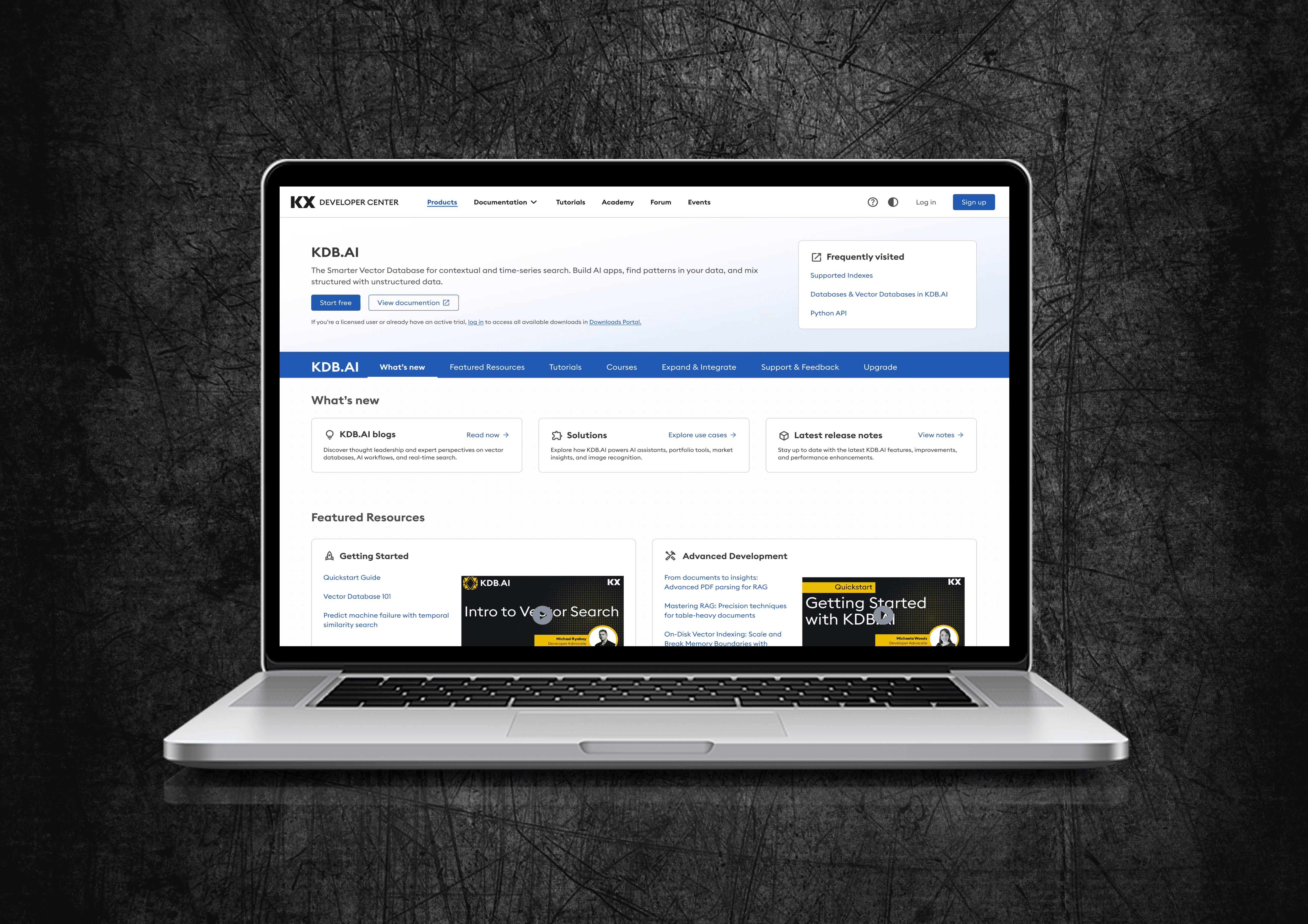
Research showed developers were split on preference. We designed both Light and Dark modes to ensure the platform is accessible, reduces eye strain, and works for every user’s environment.
Dark Mode
Light Mode
Collaboration
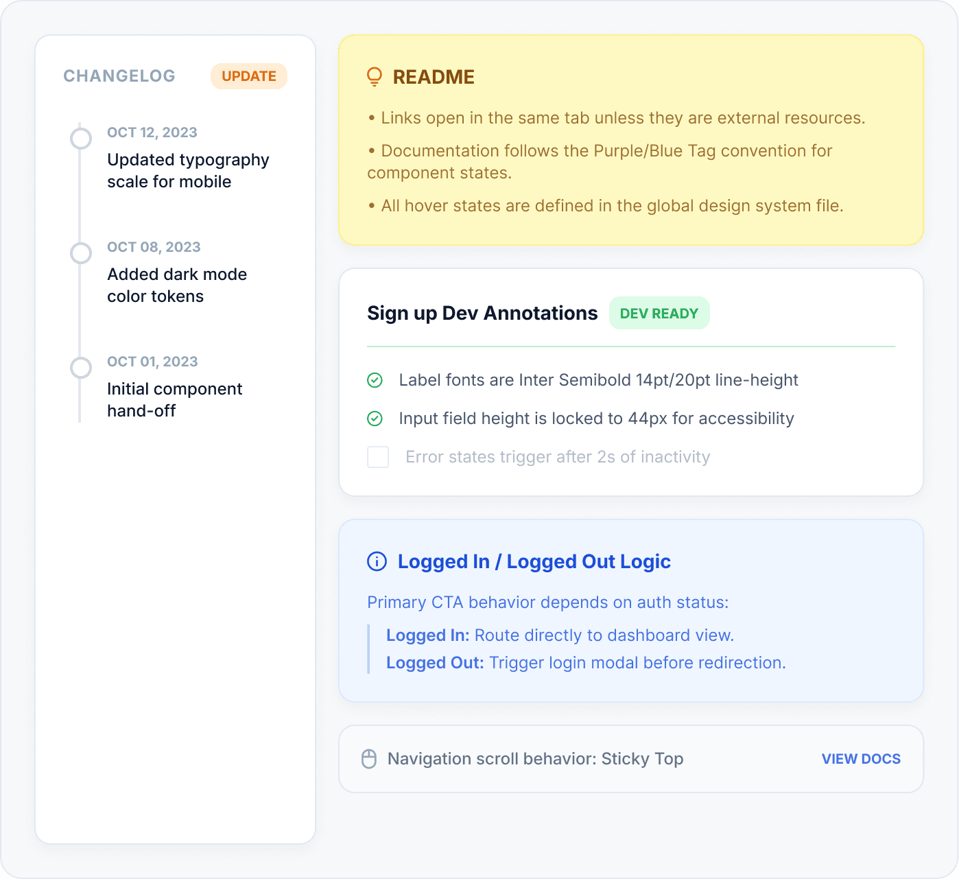
Working with Developers
From the start of the project, I collaborated closely with engineers to align on feasibility, technical constraints, and implementation trade-offs. This reduced rework and accelerated delivery.
Early Alignment
Reviewed component feasibility
Aligned on reusable patterns
Platform constraint check
Result
Fewer revisions and smoother implementation.
Structured Handoff
Detailed Figma annotations
Defined loading & empty states
Documented responsive specs
Result
Reduced ambiguity and faster front-end execution.
Feedback Loop
Dev-ready changelog tracker
Visual QA and build reviews
Iterative constraint fixes
Result
Higher visual accuracy and fewer QA cycles.
accessibility
Designing for Everyone
Developers spend hours in documentation. We designed for sustained readability and ease of navigation across both light and dark modes, exceeding WCAG AAA standards.
16.9:1 Contrast
Exceeds WCAG AAA 7:1 requirement
Semantic Headings
H1→H6 hierarchy for screen readers
Touch Targets
1440×1950 minimum tap areas, AAA compliant
Keyboard Navigation
Visible focus states on all interactive elements
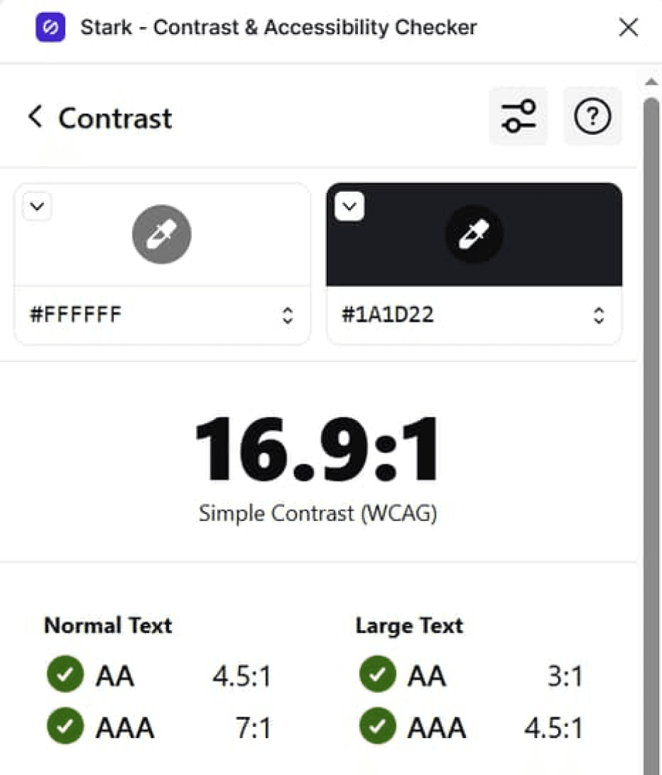
Contrast & Eye Strain
Audited to exceed WCAG AAA 7:1 ratios. Dark mode reduces strain during long sessions.
const a = () =>
'essential';
const a = () =>
'essential';
16.9:1 Contrast
Exceeds WCAG AAA 7:1 requirement
Semantic Headings
H1→H6 hierarchy for screen readers
Keyboard Navigation
Visible focus states on all interactive elements
16.9:1 Contrast
Exceeds WCAG AAA 7:1 requirement
Semantic Headings
H1→H6 hierarchy for screen readers
Touch Targets
1440×1950 minimum tap areas, AAA compliant
Keyboard Navigation
Visible focus states on all interactive elements
Reflection
What I Learned
This project significantly strengthened my ability to design for technical audiences and to build systems that balance clarity with flexibility. It reinforced how small, well-focused research insights can lead to high-impact design decisions.
#1
Internal product structure ≠ user mental model
Our initial IA was organized by KX product. Card sorting proved developers think in workflows (setup → build → deploy).
#2
One audience, two different needs
New and experienced developers want fundamentally different things from the same page.
#3
Small usability tests catch big structural mistakes
A Maze study caught the nav separation issue before engineering built it. That one test saved weeks of rework
“Most importantly, this work reinforced the value of staying curious, being open to feedback, and remaining focused on solving real user problems, especially when designing complex developer experiences.”
Developer Center
Unified Experience
KX’s developer documentation was scattered across 4 separate sites, causing slow onboarding and high drop-off. I helped design a single, unified Developer Center that consolidated all docs, guides, and tools into one experience. Shipped October 2025
KX’s developer documentation was scattered across 4 separate sites, causing slow onboarding and high drop-off. I helped design a single, unified Developer Center that consolidated all docs, guides, and tools into one experience.
Shipped October 2025
Software & Tech
Team of 4
6 months
The Challenge
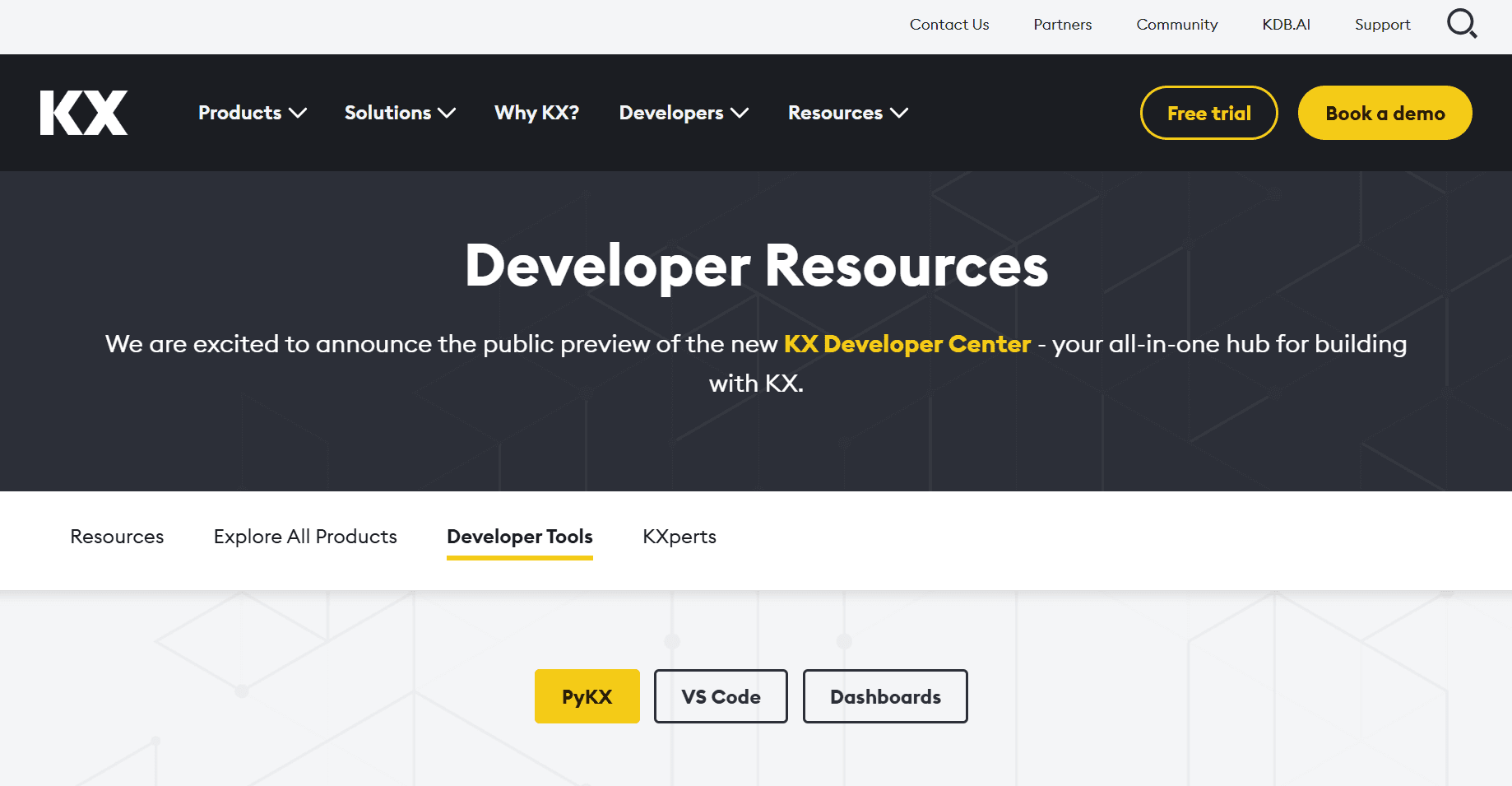
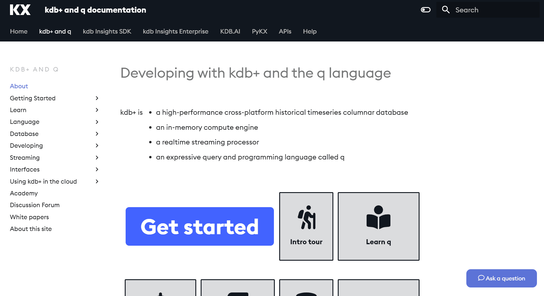
Developers relied on few disconnected documentation sites, with no shared navigation, search, or onboarding flow. New developers couldn't find a "Step 1," and experienced users wasted time jumping between portals. The result: slow adoption and early drop-off.
Design Goal
Design a single Developer Center that gives new users a clear starting path and gives experienced users fast access to a deep documentation - reducing time-to-first-action for both audiences.
Outcome
Consolidated 4 legacy sites into one Developer Center, reducing estimated time-to-first-code-example from 15 minutes to under 5mins and onboarding support questions by 45%.
My Role
Product Designer on a cross-functional team with Product and Engineering. I led research and testing - card sorting, content mapping, and a Maze usability study - translating findings into actionable recommendations. I also designed the navigation and key screens and handed off to engineering with detailed Figma annotations.
User Research
Card Sorting
Data Synthesis
Usability Testing
Prototyping
Design Handoff
Challenge
Developers relied on few disconnected documentation sites, with no shared navigation, search, or onboarding flow. New developers couldn’t find a “Step 1,” and experienced users wasted time jumping between portals. The result: slow adoption and early drop-off.
Design Goal
Design a single Developer Center that gives new users a clear starting path and gives experienced users fast access to deep documentation - reducing time-to-first-action for both audiences.
Outcome
Consolidated 4 legacy sites into one Developer Center, reducing estimated time-to-first-code-example from 15 minutes to under 5mins and onboarding support questions by 45%.
My Role
Product Designer on a cross-functional team with Product and Engineering. I synthesized developer interview insights, led the IA work (card sorting, content mapping), ran the Maze usability study, designed the navigation menu and supporting screens, contributed to the product overview IA, audited accessibility with Stark, and handed off my designs to engineering with detailed Figma annotations.
User Research
UX/UI
Prototyping
Wireframing
Usability Testing
Design Handoff
Results
Impact and Outcomes
~ 70%
reduction in time-to-first-code- example
From 15 min to under 5min
4 → 1
fragmented documentation sites unified into a single hub
Launched October 2025.
~ 45%
reduction in onboarding-related support questions
Less confusion
Phase 01
Experience Before
Developers were contacting support for answers that already existed in the docs - they just couldn't find them. With documentation spread across 4 separate sites, each with its own navigation and search, even simple tasks required jumping between portals.
Fragmentation
4 Sites
No shared navigation
Time to Hello World
~ 15min
To first code example
Competitive pressure
High
Developer docs falling behind industry standard
Decision Rationale
Why Not Just Connect the Existing Sites?
Stakeholders initially considered adding shared navigation across existing sites, but our research showed the problem ran deeper than navigation.
The problem wasn't navigation - it was that developers had to relearn the interface every time they switched sites. Connecting the sites wouldn't fix that. Only rebuilding as one experience would.
1
code.kx.com/home/index.html
Product docs hub - dense text, no onboarding
2
docs.kx.com/home/index.htm
Enterprise docs - separate nav, different visual style
3
kx.com/developers/developer-tools/
Developer marketing page - no code examples
4
code.kx.com/q/
kdb+/q docs - isolated from other products
Phase 02
Experience After
One hub, one navigation, one search - from 4 scattered sites to a single Developer Center.
What the new experience delivers:
4 sites → 1 unified platform with shared search
Task-based navigation validated by card sorting with 15 devs
15 min → under 5min to first code example
Segmented paths for new users and experienced users
Results
Impact and Outcomes
70%
reduction in time-to-first-code- example
From 15 min to under 5min
4 → 1
fragmented documentation sites unified into a single hub
Launched October 2025.
45%
reduction in onboarding-related support questions
Less confusion
70%
reduction in time-to-first-code- example
From 15 min to under 5min
4 → 1
fragmented doc sites unified into a single hub
Launched
October 2025
45%
reduction in onboarding-related support questions
Less confusion
~ 70%
reduction in time-to-first-code- example
From 15 min to under 5min
4 → 1
fragmented documentation sites unified into a single hub
Launched October 2025.
~ 45%
reduction in onboarding-related support questions
Less confusion
Phase 01
Experience Before
Developers were contacting support for answers that already existed in the docs - they just couldn't find them. With documentation spread across 4 separate sites, each with its own navigation and search, even simple tasks required jumping between portals.
Fragmentation
4 Sites
No shared navigation
Time to Hello World
~ 15min
To first code example
Competitive pressure
High
Developer docs falling behind industry standard
Fragmentation
4 Sites
No shared navigation
Time to Hello World
~ 15min
To first code example
Competitive pressure
High
Developer docs falling behind industry standard
Decision Rationale
Why Not Just Connect the Existing Sites?
Stakeholders initially considered adding shared navigation across existing sites, but our research showed the problem ran deeper than navigation.
The problem wasn't navigation - it was that developers had to relearn the interface every time they switched sites. Connecting the sites wouldn't fix that. Only rebuilding as one experience would.
1
code.kx.com/home/index.html
Product docs hub - dense text, no onboarding
2
docs.kx.com/home/index.htm
Enterprise docs - separate nav, different visual style
3
kx.com/developers/developer-tools/
Developer marketing page - no code examples
4
code.kx.com/q/
kdb+/q docs - isolated from other products
1
code.kx.com/home/index.html
Product docs hub - dense text, no onboarding
2
docs.kx.com/home/index.htm
Enterprise docs - separate nav, different visual style
3
kx.com/developers/developer-tools/
Developer marketing page - no code examples
4
code.kx.com/q/
kdb+/q docs - isolated from other products
1
code.kx.com/home/index.html
Product docs hub - dense text, no onboarding
2
docs.kx.com/home/index.htm
Enterprise docs - separate nav, different visual style
3
kx.com/developers/developer-tools/
Developer marketing page - no code examples
4
code.kx.com/q/
kdb+/q docs - isolated from other products
Phase 02
Experience After
One hub, one navigation, one search - from 4 scattered sites to a single Developer Center.
What the new experience delivers:
15 min → under 5min to first code example
4 sites → 1 unified platform with shared search
Task-based navigation organized by workflow instead of product-based site structure.
Separate paths for beginners and power users instead of one-size-fits-all
4 sites → 1 unified platform with shared search
Task-based navigation organized by workflow instead of product-based site structure.
15 min → under 5min to first code example
Separate paths for beginners and power users instead of one-size-fits-all
Research
Understanding the Users
How I Gathered Insights
Focus Group Interviews
I synthesized feedback from developer focus group interviews to identify recurring pain points around onboarding clarity, content organization, and differences between new and experienced users.
These insights helped prioritize which problems required design intervention and informed how content should be structured.
Questions we asked:
“What do you usually look for when starting with a new tool?”
“What makes a developer experience feel frustrating?”
Research Challenge
"The loudest voice isn't always the most representative."
In early focus groups, one participant consistently dominated the conversation. Quieter developers ( often the ones struggling most ) weren't speaking up. So I pivoted to 1:1 interviews, and that's when the real pain points surfaced.
Core Interview Finding
"The biggest friction point is the lack of a clear 'Step 1' - I want to feel guided, not lost in documentation."
📊 Maze Study
To validate and quantify qualitative themes, I ran a Maze survey with 9 participants to assess expectations, usability gaps, and content priorities.
83%
New users prioritize guided onboarding
First time users said onboarding were top-priority, confirming the need for a clear starting point
Experienced users value depth and efficiency
Advanced users focused on deeper admin and support content, signaling need for segmented pathways.
Card sorting & Information Architecture
Ran a card sorting exercise to understand how users naturally group content. This helped design the experience based on how users think, not our assumptions.
15 Participants
Open sort
60+ content items
Key Insights & Patterns
“I group things by workflow - setup, build, deploy.”
“I’m thinking about the task I need to complete, not which product it belongs to.”
“Product categories don’t help me when I’m trying to solve something.”
Task-Based Grouping
Users grouped content by workflow and goals - not internal product structure.
“I need a clear ‘start here’ section.”
“If I’m new, I don’t want to dig for the first step.”
“I just want to know what to do first.”
Clear Entry Points Needed
New users consistently clustered onboarding and setup together, suggesting a dedicated "First Experience" zone in the primary navigation.
“Let me jump straight to trouble
shooting.”
“Advanced docs should be separate from beginner guides.”
“If I’m stuck, I want the answer fast.”
Efficiency for Advanced Users
Experienced developers grouped troubleshooting and optimization content separately, valuing speed of lookup over linear narrative flow.
Research
Understanding the Users
How I Gathered Insights
Focus Group Interviews
I synthesized feedback from 8 developer focus group interviews to identify recurring pain points around onboarding clarity, content organization, and differences between new and experienced users.
These insights helped prioritize which problems required design intervention and informed how content should be structured.
Questions we asked:
“What do you usually look for when starting with a new tool?”
“What makes a developer experience feel frustrating?”
Research Challenge
"The loudest voice isn't always the most representative."
In early focus groups, one participant consistently dominated the conversation. Quieter developers ( often the ones struggling most ) weren't speaking up. So I pivoted to 1:1 interviews, and that's when the real pain points surfaced.
Focus Group Interviews
The plan was to conduct 8 focus group interviews ( with 4 users in each group) to identify onboarding friction, content clarity gaps, and differences between new and experienced users.
However, I faced the challenge and decided to continue with 1:1 interviews instead.
Questions we asked:
“What do you usually look for when starting with a new tool?”
“What makes a developer experience feel frustrating?”
Research Challenge
"The loudest voice isn't always the most representative."
In early focus groups, one participant consistently dominated the conversation. Quieter developers ( often the ones struggling most ) weren't speaking up. So I pivoted to 1:1 interviews, and that's when the real pain points surfaced.
Core Interview Finding
"The biggest friction point is the lack of a clear 'Step 1' - I want to feel guided, not lost in documentation."
📊 Maze Study
To validate qualitative insights, I ran a Maze survey with 9 participants to assess onboarding expectations and content priorities.
83%
New users prioritize guided onboarding
Experienced users value depth and efficiency
Highlighted the need for segmented pathways and advanced documentation.
83%
New users prioritize guided onboarding
Experienced users value depth and efficiency
📊 Maze Study
To validate and quantify qualitative themes, I ran a Maze survey with 9 participants to assess expectations, usability gaps, and content priorities.
Core Interview Finding
"The biggest friction point is the lack of a clear 'Step 1' - I want to feel guided, not lost in documentation."
How I Gathered Insights
Research Challenge
"The loudest voice isn't always the most representative."
In early focus groups, one participant consistently dominated the conversation. Quieter developers ( often the ones struggling most ) weren't speaking up. So I pivoted to 1:1 interviews, and that's when the real pain points surfaced.
Focus Group Interviews
I synthesized feedback from 8 developer focus group interviews to identify recurring pain points around onboarding clarity, content organization, and differences between new and experienced users.
These insights helped prioritize which problems required design intervention and informed how content should be structured.
Questions we asked:
“What do you usually look for when starting with a new tool?”
“What makes a developer experience feel frustrating?”
Card Sorting & Information Architecture
I ran a card sorting exercise to understand how users naturally group content. This helped design the experience based on how users think, not our assumptions.
15 Participant
Open sort
40+ items
15 Participants
Open sort
60+ content items
“I group things by workflow - setup, build, deploy.”
“I’m thinking about the task I need to complete, not which product it belongs to.”
“Product categories don’t help me when I’m trying to solve something.”
Task-Based Grouping
Users grouped content by workflow and goals - not internal product structure.
“I need a clear ‘start here’ section.”
“If I’m new, I don’t want to dig for the first step.”
“I just want to know what to do first.”
Clear Entry Points Needed
New users consistently clustered onboarding and setup together, suggesting a dedicated "First Experience" zone in the primary navigation.
“Let me jump straight to trouble
shooting.”
“Advanced docs should be separate from beginner guides.”
“If I’m stuck, I want the answer fast.”
Efficiency for Advanced Users
Experienced developers grouped troubleshooting and optimization content separately, valuing speed of lookup over linear narrative flow.
Key Insights & Patterns
“I group things by workflow - setup, build, deploy.”
“I’m thinking about the task I need to complete, not which product it belongs to.”
“Product categories don’t help me when I’m trying to solve something.”
Task-Based Grouping
Users grouped content by workflow and goals, not internal product structure.
“I need a clear ‘start here’ section.”
“If I’m new, I don’t want to dig for the first step.”
“I just want to know what to do first.”
Clear Entry Points Needed
New users consistently clustered onboarding and setup together, suggesting a dedicated "First Experience" zone in the primary navigation.
“Let me jump straight to trouble
shooting.”
“Advanced docs should be separate from beginner guides.”
“If I’m stuck, I want the answer fast.”
Efficiency for Advanced Users
Experienced developers grouped troubleshooting and optimization content separately, valuing speed of lookup over linear flow.
Design & Test
Prototypes & Validation
Site Navigation
First concept separated “Products” and “Documentation” into two menus, however usability testing showed developers expected docs to live next to the product they were using. I merged them into a single “Product & Docs” dropdown, grouping each product with its documentation and adding clear action labels (“Explore” / “Documentation”).
First Concept
Fragmented navigation with separated menus for "Products" and "Documentation"
After Research
Unified "Product & Docs" hierarchy to improve discoverability and reduce cognitive load.
I conducted Maze A/B test, which showed that Variant B was the winner.
Product Overview Page
The first concept product page had no clear entry point - developers had to scan mixed-level docs before taking any action. I recommended to redesigned it with four key changes and validated it through usability testing with developers across experience levels.
First Concept
💡 The original interface lacked a clear entry point, forcing developers to scan through mixed-level documentation before taking their first action.
After Research
First Concept
💡 The original interface lacked a clear entry point, forcing developers to scan through mixed-level documentation before taking their first action.
After Research
Added 'Frequently Visited' links
Before: Users had to dig through menus.
Impact: Faster daily navigation.
New 'What’s New' hub
Before: No clear path for developers.
Impact: Easier for new users.
Separated beginner & advanced flows
Before: Mixed content caused confusion.
Impact: Efficient for all users.
One-click code copy
Before: Examples were hard to copy.
Impact: Faster testing and deployment.
First Concept
Added 'Frequently Visited' links
Before: Users had to dig through menus.
Impact: Faster daily navigation.
New 'What’s New' hub
Before: No clear path for developers.
Impact: Easier for new users.
Separated beginner & advanced flows
Before: Mixed content caused confusion.
Impact: Efficient for all users.
One-click code copy
Before: Examples were hard to copy.
Impact: Faster testing and deployment.
After Research
Added 'Frequently Visited' links
Before: Users had to dig through menus.
Impact: Faster daily navigation.
New 'What’s New' hub
Before: No clear path for developers.
Impact: Easier for new users.
Separated beginner & advanced flows
Before: Mixed content caused confusion.
Impact: Efficient for all users.
One-click code copy
Before: Examples were hard to copy.
Impact: Faster testing and deployment.
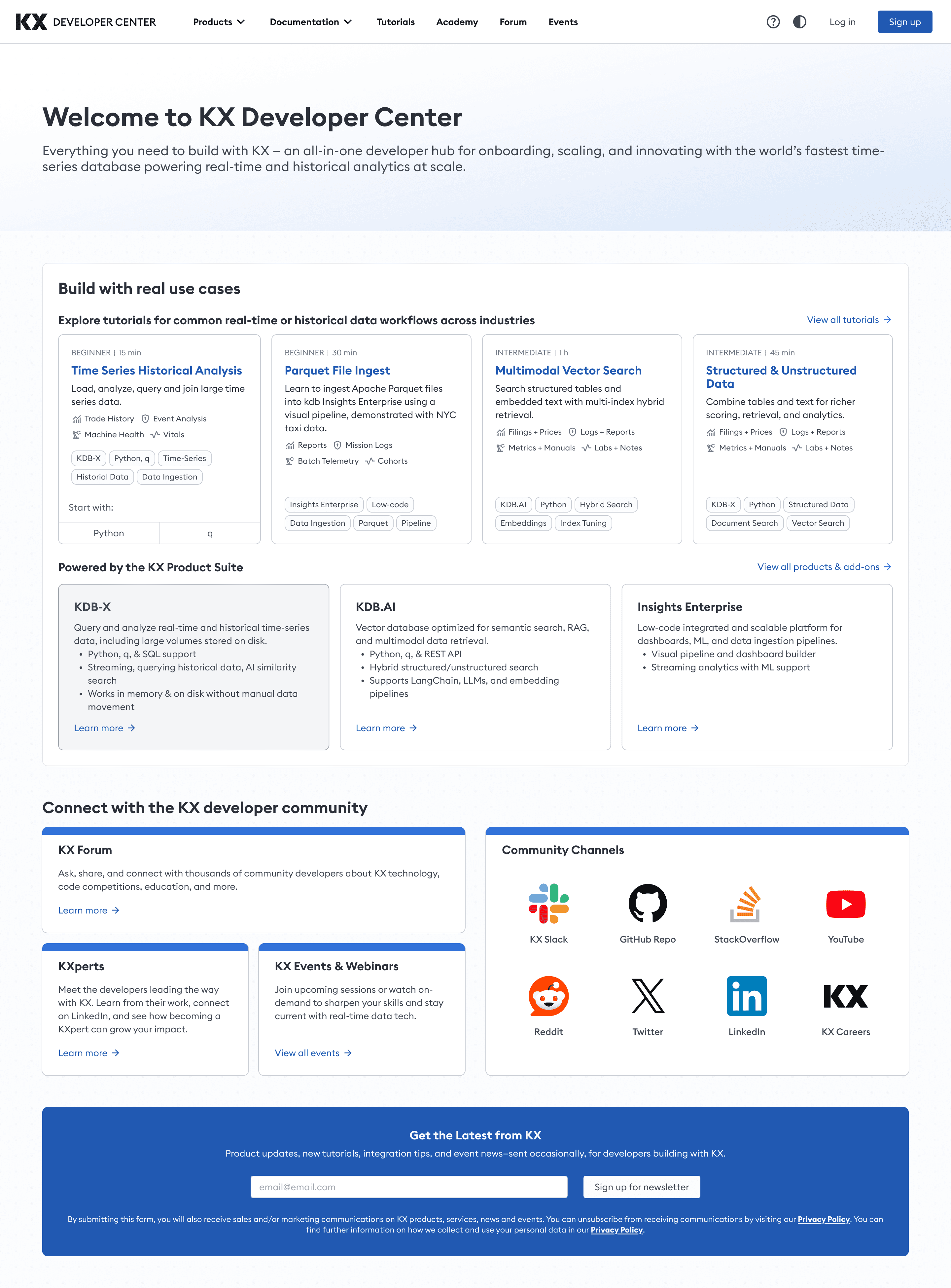
Landing Page
Research showed developers were split on preference. We designed both Light and Dark modes to ensure the platform is accessible, reduces eye strain, and works for every user’s environment.
Dark Mode
Light Mode
Collaboration
Working with Developers
From the start of the project, I collaborated closely with engineers to align on feasibility, technical constraints, and implementation trade-offs. This reduced rework and accelerated delivery.
Early Alignment
Reviewed component feasibility
Aligned on reusable patterns
Platform constraint check
Result
Fewer revisions and smoother implementation.
Structured Handoff
Detailed Figma annotations
Defined loading & empty states
Documented responsive specs
Result
Reduced ambiguity and faster front-end execution.
Feedback Loop
Dev-ready changelog tracker
Visual QA and build reviews
Iterative constraint fixes
Result
Higher visual accuracy and fewer QA cycles.
Early Alignment
Reviewed component feasibility
Aligned on reusable patterns
Platform constraint check
Result
Fewer revisions and smoother implementation.
Structured Handoff
Detailed Figma annotations
Defined loading & empty states
Documented responsive specs
Result
Reduced ambiguity and faster front-end execution.
Feedback Loop
Dev-ready changelog tracker
Visual QA and build reviews
Iterative constraint fixes
Result
Higher visual accuracy and fewer QA cycles.
Early Alignment
Reviewed component feasibility
Aligned on reusable patterns
Platform constraint check
Result
Fewer revisions and smoother implementation.
Structured Handoff
Detailed Figma annotations
Defined loading & empty states
Documented responsive specs
Result
Reduced ambiguity and faster front-end execution.
Feedback Loop
Dev-ready changelog tracker
Visual QA and build reviews
Iterative constraint fixes
Result
Higher visual accuracy and fewer QA cycles.
Early Alignment
Reviewed component feasibility
Aligned on reusable patterns
Platform constraint check
Result
Fewer revisions and smoother implementation.
Structured Handoff
Detailed Figma annotations
Defined loading & empty states
Documented responsive specs
Result
Reduced ambiguity and faster front-end execution.
Feedback Loop
Dev-ready changelog tracker
Visual QA and build reviews
Iterative constraint fixes
Result
Higher visual accuracy and fewer QA cycles.
accessibility
Designing for Everyone
Developers spend hours in documentation. We designed for sustained readability and ease of navigation across both light and dark modes, exceeding WCAG AAA standards.
16.9:1 Contrast
Exceeds WCAG AAA 7:1 requirement
Semantic Headings
H1→H6 hierarchy for screen readers
Touch Targets
1440×1950 minimum tap areas, AAA compliant
Keyboard Navigation
Visible focus states on all interactive elements
Contrast & Eye Strain
Audited to exceed WCAG AAA 7:1 ratios. Dark mode reduces strain during long sessions.
const a = () =>
'essential';
const a = () =>
'essential';
16.9:1 Contrast
Exceeds WCAG AAA 7:1 requirement
Semantic Headings
H1→H6 hierarchy for screen readers
Keyboard Navigation
Visible focus states on all interactive elements
16.9:1 Contrast
Exceeds WCAG AAA 7:1 requirement
Semantic Headings
H1→H6 hierarchy for screen readers
Touch Targets
1440×1950 minimum tap areas, AAA compliant
Keyboard Navigation
Visible focus states on all interactive elements
Reflection
What I Learned
This project significantly strengthened my ability to design for technical audiences and to build systems that balance clarity with flexibility. It reinforced how small, well-focused research insights can lead to high-impact design decisions.
#1
Internal product structure ≠ user mental model
Our initial IA was organized by KX product. Card sorting proved developers think in workflows (setup → build → deploy).
#2
One audience, two different needs
New and experienced developers want fundamentally different things from the same page.
#3
Small usability tests catch big structural mistakes
A Maze study caught the nav separation issue before engineering built it. That one test saved weeks of rework
#1
Internal product structure ≠ user mental model
Our initial IA was organized by KX product. Card sorting proved developers think in workflows (setup → build → deploy).
#2
One audience, two different needs
New and experienced developers want fundamentally different things from the same page.
#3
Small usability tests catch big structural mistakes
A Maze study caught the nav separation issue before engineering built it. That one test saved weeks of rework
#1
Internal product structure ≠ user mental model
Our initial IA was organized by KX product. Card sorting proved developers think in workflows (setup → build → deploy).
#2
One audience, two different needs
New and experienced developers want fundamentally different things from the same page.
#3
Small usability tests catch big structural mistakes
A Maze study caught the nav separation issue before engineering built it. That one test saved weeks of rework
“Most importantly, this work reinforced the value of staying curious, being open to feedback, and remaining focused on solving real user problems, especially when designing complex developer experiences.”
Developer Center:
A Unified Experience
KX’s developer documentation was scattered across 4 separate sites, causing slow onboarding and high drop-off. I helped design a single, unified Developer Center that consolidated all docs, guides, and tools into one experience. Shipped October 2025
KX’s developer documentation was scattered across 4 separate sites, causing slow onboarding and high drop-off. I helped design a single, unified Developer Center that consolidated all docs, guides, and tools into one experience.
Shipped October 2025
Software & Tech
Team of 4
6 months
The Challenge
Developers relied on few disconnected documentation sites, with no shared navigation, search, or onboarding flow. New developers couldn't find a "Step 1," and experienced users wasted time jumping between portals. The result: slow adoption and early drop-off.
Design Goal
Design a single Developer Center that gives new users a clear starting path and gives experienced users fast access to a deep documentation - reducing time-to-first-action for both audiences.
Outcome
Consolidated 4 legacy sites into one Developer Center, reducing estimated time-to-first-code-example from 15 minutes to under 5mins and onboarding support questions by 45%.
My Role
Product Designer on a cross-functional team with Product and Engineering. I led research and testing - card sorting, content mapping, and a Maze usability study - translating findings into actionable recommendations. I also designed the navigation and key screens and handed off to engineering with detailed Figma annotations.
User Research
Card Sorting
Data Synthesis
Usability Testing
Prototyping
Design Handoff
Challenge
Developers relied on few disconnected documentation sites, with no shared navigation, search, or onboarding flow. New developers couldn’t find a “Step 1,” and experienced users wasted time jumping between portals. The result: slow adoption and early drop-off.
Design Goal
Design a single Developer Center that gives new users a clear starting path and gives experienced users fast access to deep documentation - reducing time-to-first-action for both audiences.
Outcome
Consolidated 4 legacy sites into one Developer Center, reducing estimated time-to-first-code-example from 15 minutes to under 5mins and onboarding support questions by 45%.
My Role
Product Designer on a cross-functional team with Product and Engineering. I synthesized developer interview insights, led the IA work (card sorting, content mapping), ran the Maze usability study, designed the navigation menu and supporting screens, contributed to the product overview IA, audited accessibility with Stark, and handed off my designs to engineering with detailed Figma annotations.
User Research
UX/UI
Prototyping
Wireframing
Usability Testing
Design Handoff
Results
Impact and Outcomes
~ 70%
reduction in time-to-first-code- example
From 15 min to under 5min
4 → 1
fragmented documentation sites unified into a single hub
Launched October 2025.
~ 45%
reduction in onboarding-related support questions
Less confusion
Phase 01
Experience Before
Developers were contacting support for answers that already existed in the docs - they just couldn't find them. With documentation spread across 4 separate sites, each with its own navigation and search, even simple tasks required jumping between portals.
Fragmentation
4 Sites
No shared navigation
Time to Hello World
~ 15min
To first code example
Competitive pressure
High
Developer docs falling behind industry standard
Decision Rationale
Why Not Just Connect the Existing Sites?
Stakeholders initially considered adding shared navigation across existing sites, but our research showed the problem ran deeper than navigation.
The problem wasn't navigation - it was that developers had to relearn the interface every time they switched sites. Connecting the sites wouldn't fix that. Only rebuilding as one experience would.
1
code.kx.com/home/index.html
Product docs hub - dense text, no onboarding
2
docs.kx.com/home/index.htm
Enterprise docs - separate nav, different visual style
3
kx.com/developers/developer-tools/
Developer marketing page - no code examples
4
code.kx.com/q/
kdb+/q docs - isolated from other products
Phase 02
Experience After
One hub, one navigation, one search - from 4 scattered sites to a single Developer Center.
What the new experience delivers:
4 sites → 1 unified platform with shared search
Task-based navigation validated by card sorting with 15 devs
15 min → under 5min to first code example
Segmented paths for new users and experienced users
Results
Impact and Outcomes
70%
reduction in time-to-first-code- example
From 15 min to under 5min
4 → 1
fragmented documentation sites unified into a single hub
Launched October 2025.
45%
reduction in onboarding-related support questions
Less confusion
70%
reduction in time-to-first-code- example
From 15 min to under 5min
4 → 1
fragmented doc sites unified into a single hub
Launched
October 2025
45%
reduction in onboarding-related support questions
Less confusion
~ 70%
reduction in time-to-first-code- example
From 15 min to under 5min
4 → 1
fragmented documentation sites unified into a single hub
Launched October 2025.
~ 45%
reduction in onboarding-related support questions
Less confusion
Phase 01
Experience Before
Developers were contacting support for answers that already existed in the docs - they just couldn't find them. With documentation spread across 4 separate sites, each with its own navigation and search, even simple tasks required jumping between portals.
Fragmentation
4 Sites
No shared navigation
Time to Hello World
~ 15min
To first code example
Competitive pressure
High
Developer docs falling behind industry standard
Fragmentation
4 Sites
No shared navigation
Time to Hello World
~ 15min
To first code example
Competitive pressure
High
Developer docs falling behind industry standard
Decision Rationale
Why Not Just Connect the Existing Sites?
Stakeholders initially considered adding shared navigation across existing sites, but our research showed the problem ran deeper than navigation.
The problem wasn't navigation - it was that developers had to relearn the interface every time they switched sites. Connecting the sites wouldn't fix that. Only rebuilding as one experience would.
1
code.kx.com/home/index.html
Product docs hub - dense text, no onboarding
2
docs.kx.com/home/index.htm
Enterprise docs - separate nav, different visual style
3
kx.com/developers/developer-tools/
Developer marketing page - no code examples
4
code.kx.com/q/
kdb+/q docs - isolated from other products
1
code.kx.com/home/index.html
Product docs hub - dense text, no onboarding
2
docs.kx.com/home/index.htm
Enterprise docs - separate nav, different visual style
3
kx.com/developers/developer-tools/
Developer marketing page - no code examples
4
code.kx.com/q/
kdb+/q docs - isolated from other products
1
code.kx.com/home/index.html
Product docs hub - dense text, no onboarding
2
docs.kx.com/home/index.htm
Enterprise docs - separate nav, different visual style
3
kx.com/developers/developer-tools/
Developer marketing page - no code examples
4
code.kx.com/q/
kdb+/q docs - isolated from other products
Phase 02
Experience After
One hub, one navigation, one search - from 4 scattered sites to a single Developer Center.
What the new experience delivers:
15 min → under 5min to first code example
4 sites → 1 unified platform with shared search
Task-based navigation organized by workflow instead of product-based site structure.
Separate paths for beginners and power users instead of one-size-fits-all
4 sites → 1 unified platform with shared search
Task-based navigation organized by workflow instead of product-based site structure.
15 min → under 5min to first code example
Separate paths for beginners and power users instead of one-size-fits-all
Research
Understanding the Users
How I Gathered Insights
Focus Group Interviews
I synthesized feedback from developer focus group interviews to identify recurring pain points around onboarding clarity, content organization, and differences between new and experienced users.
These insights helped prioritize which problems required design intervention and informed how content should be structured.
Questions we asked:
“What do you usually look for when starting with a new tool?”
“What makes a developer experience feel frustrating?”
Research Challenge
"The loudest voice isn't always the most representative."
In early focus groups, one participant consistently dominated the conversation. Quieter developers ( often the ones struggling most ) weren't speaking up. So I pivoted to 1:1 interviews, and that's when the real pain points surfaced.
Core Interview Finding
"The biggest friction point is the lack of a clear 'Step 1' - I want to feel guided, not lost in documentation."
📊 Maze Study
To validate and quantify qualitative themes, I ran a Maze survey with 9 participants to assess expectations, usability gaps, and content priorities.
83%
New users prioritize guided onboarding
First time users said onboarding were top-priority, confirming the need for a clear starting point
Experienced users value depth and efficiency
Advanced users focused on deeper admin and support content, signaling need for segmented pathways.
Card sorting & Information Architecture
Ran a card sorting exercise to understand how users naturally group content. This helped design the experience based on how users think, not our assumptions.
15 Participants
Open sort
60+ content items
Key Insights & Patterns
“I group things by workflow - setup, build, deploy.”
“I’m thinking about the task I need to complete, not which product it belongs to.”
“Product categories don’t help me when I’m trying to solve something.”
Task-Based Grouping
Users grouped content by workflow and goals - not internal product structure.
“I need a clear ‘start here’ section.”
“If I’m new, I don’t want to dig for the first step.”
“I just want to know what to do first.”
Clear Entry Points Needed
New users consistently clustered onboarding and setup together, suggesting a dedicated "First Experience" zone in the primary navigation.
“Let me jump straight to trouble
shooting.”
“Advanced docs should be separate from beginner guides.”
“If I’m stuck, I want the answer fast.”
Efficiency for Advanced Users
Experienced developers grouped troubleshooting and optimization content separately, valuing speed of lookup over linear narrative flow.
Research
Understanding the Users
How I Gathered Insights
Focus Group Interviews
I synthesized feedback from 8 developer focus group interviews to identify recurring pain points around onboarding clarity, content organization, and differences between new and experienced users.
These insights helped prioritize which problems required design intervention and informed how content should be structured.
Questions we asked:
“What do you usually look for when starting with a new tool?”
“What makes a developer experience feel frustrating?”
Research Challenge
"The loudest voice isn't always the most representative."
In early focus groups, one participant consistently dominated the conversation. Quieter developers ( often the ones struggling most ) weren't speaking up. So I pivoted to 1:1 interviews, and that's when the real pain points surfaced.
Focus Group Interviews
The plan was to conduct 8 focus group interviews ( with 4 users in each group) to identify onboarding friction, content clarity gaps, and differences between new and experienced users.
However, I faced the challenge and decided to continue with 1:1 interviews instead.
Questions we asked:
“What do you usually look for when starting with a new tool?”
“What makes a developer experience feel frustrating?”
Research Challenge
"The loudest voice isn't always the most representative."
In early focus groups, one participant consistently dominated the conversation. Quieter developers ( often the ones struggling most ) weren't speaking up. So I pivoted to 1:1 interviews, and that's when the real pain points surfaced.
Core Interview Finding
"The biggest friction point is the lack of a clear 'Step 1' - I want to feel guided, not lost in documentation."
📊 Maze Study
To validate qualitative insights, I ran a Maze survey with 9 participants to assess onboarding expectations and content priorities.
83%
New users prioritize guided onboarding
Confirmed the need for a clear starting point on the homepage.
Experienced users value depth and efficiency
Highlighted the need for segmented pathways and advanced documentation.
83%
New users prioritize guided onboarding
Experienced users value depth and efficiency
📊 Maze Study
To validate and quantify qualitative themes, I ran a Maze survey with 9 participants to assess expectations, usability gaps, and content priorities.
Core Interview Finding
"The biggest friction point is the lack of a clear 'Step 1' - I want to feel guided, not lost in documentation."
How I Gathered Insights
Research Challenge
"The loudest voice isn't always the most representative."
In early focus groups, one participant consistently dominated the conversation. Quieter developers ( often the ones struggling most ) weren't speaking up. So I pivoted to 1:1 interviews, and that's when the real pain points surfaced.
Focus Group Interviews
I synthesized feedback from 8 developer focus group interviews to identify recurring pain points around onboarding clarity, content organization, and differences between new and experienced users.
These insights helped prioritize which problems required design intervention and informed how content should be structured.
Questions we asked:
“What do you usually look for when starting with a new tool?”
“What makes a developer experience feel frustrating?”
Card Sorting & Information Architecture
I ran a card sorting exercise to understand how users naturally group content. This helped design the experience based on how users think, not our assumptions.
15 Participant
Open sort
40+ items
15 Participants
Open sort
60+ content items
“I group things by workflow - setup, build, deploy.”
“I’m thinking about the task I need to complete, not which product it belongs to.”
“Product categories don’t help me when I’m trying to solve something.”
Task-Based Grouping
Users grouped content by workflow and goals - not internal product structure.
“I need a clear ‘start here’ section.”
“If I’m new, I don’t want to dig for the first step.”
“I just want to know what to do first.”
Clear Entry Points Needed
New users consistently clustered onboarding and setup together, suggesting a dedicated "First Experience" zone in the primary navigation.
“Let me jump straight to trouble
shooting.”
“Advanced docs should be separate from beginner guides.”
“If I’m stuck, I want the answer fast.”
Efficiency for Advanced Users
Experienced developers grouped troubleshooting and optimization content separately, valuing speed of lookup over linear narrative flow.
Key Insights & Patterns
“I group things by workflow - setup, build, deploy.”
“I’m thinking about the task I need to complete, not which product it belongs to.”
“Product categories don’t help me when I’m trying to solve something.”
Task-Based Grouping
Users grouped content by workflow and goals, not internal product structure.
“I need a clear ‘start here’ section.”
“If I’m new, I don’t want to dig for the first step.”
“I just want to know what to do first.”
Clear Entry Points Needed
New users consistently clustered onboarding and setup together, suggesting a dedicated "First Experience" zone in the primary navigation.
“Let me jump straight to trouble
shooting.”
“Advanced docs should be separate from beginner guides.”
“If I’m stuck, I want the answer fast.”
Efficiency for Advanced Users
Experienced developers grouped troubleshooting and optimization content separately, valuing speed of lookup over linear flow.
Design & Test
Prototypes & Validation
Site Navigation
First concept separated “Products” and “Documentation” into two menus, however usability testing showed developers expected docs to live next to the product they were using. I merged them into a single “Product & Docs” dropdown, grouping each product with its documentation and adding clear action labels (“Explore” / “Documentation”).
First Concept
Fragmented navigation with separated menus for "Products" and "Documentation"
After Research
Unified "Product & Docs" hierarchy to improve discoverability and reduce cognitive load.
I conducted Maze A/B test, which showed that Variant B was the winner.
Product Overview Page
The first concept product page had no clear entry point - developers had to scan mixed-level docs before taking any action. I recommended to redesigned it with four key changes and validated it through usability testing with developers across experience levels.
First Concept
💡 The original interface lacked a clear entry point, forcing developers to scan through mixed-level documentation before taking their first action.
After Research
First Concept
💡 The original interface lacked a clear entry point, forcing developers to scan through mixed-level documentation before taking their first action.
After Research
Added 'Frequently Visited' links
Before: Users had to dig through menus.
Impact: Faster daily navigation.
New 'What’s New' hub
Before: No clear path for developers.
Impact: Easier for new users.
Separated beginner & advanced flows
Before: Mixed content caused confusion.
Impact: Efficient for all users.
One-click code copy
Before: Examples were hard to copy.
Impact: Faster testing and deployment.
First Concept
Added 'Frequently Visited' links
Before: Users had to dig through menus.
Impact: Faster daily navigation.
New 'What’s New' hub
Before: No clear path for developers.
Impact: Easier for new users.
Separated beginner & advanced flows
Before: Mixed content caused confusion.
Impact: Efficient for all users.
One-click code copy
Before: Examples were hard to copy.
Impact: Faster testing and deployment.
After Research
First Concept
Added 'Frequently Visited' links
Before: Users had to dig through menus.
Impact: Faster daily navigation.
New 'What’s New' hub
Before: No clear path for developers.
Impact: Easier for new users.
Separated beginner & advanced flows
Before: Mixed content caused confusion.
Impact: Efficient for all users.
One-click code copy
Before: Examples were hard to copy.
Impact: Faster testing and deployment.
After Research
Added 'Frequently Visited' links
Before: Users had to dig through menus.
Impact: Faster daily navigation.
New 'What’s New' hub
Before: No clear path for developers.
Impact: Easier for new users.
Separated beginner & advanced flows
Before: Mixed content caused confusion.
Impact: Efficient for all users.
One-click code copy
Before: Examples were hard to copy.
Impact: Faster testing and deployment.
Landing Page
Research showed developers were split on preference. We designed both Light and Dark modes to ensure the platform is accessible, reduces eye strain, and works for every user’s environment.
Dark Mode
Light Mode
Collaboration
Working with Developers
From the start of the project, I collaborated closely with engineers to align on feasibility, technical constraints, and implementation trade-offs. This reduced rework and accelerated delivery.
Early Alignment
Reviewed component feasibility
Aligned on reusable patterns
Platform constraint check
Result
Fewer revisions and smoother implementation.
Structured Handoff
Detailed Figma annotations
Defined loading & empty states
Documented responsive specs
Result
Reduced ambiguity and faster front-end execution.
Feedback Loop
Dev-ready changelog tracker
Visual QA and build reviews
Iterative constraint fixes
Result
Higher visual accuracy and fewer QA cycles.
Early Alignment
Reviewed component feasibility
Aligned on reusable patterns
Platform constraint check
Result
Fewer revisions and smoother implementation.
Structured Handoff
Detailed Figma annotations
Defined loading & empty states
Documented responsive specs
Result
Reduced ambiguity and faster front-end execution.
Feedback Loop
Dev-ready changelog tracker
Visual QA and build reviews
Iterative constraint fixes
Result
Higher visual accuracy and fewer QA cycles.
Early Alignment
Reviewed component feasibility
Aligned on reusable patterns
Platform constraint check
Result
Fewer revisions and smoother implementation.
Structured Handoff
Detailed Figma annotations
Defined loading & empty states
Documented responsive specs
Result
Reduced ambiguity and faster front-end execution.
Feedback Loop
Dev-ready changelog tracker
Visual QA and build reviews
Iterative constraint fixes
Result
Higher visual accuracy and fewer QA cycles.
Early Alignment
Reviewed component feasibility
Aligned on reusable patterns
Platform constraint check
Result
Fewer revisions and smoother implementation.
Structured Handoff
Detailed Figma annotations
Defined loading & empty states
Documented responsive specs
Result
Reduced ambiguity and faster front-end execution.
Feedback Loop
Dev-ready changelog tracker
Visual QA and build reviews
Iterative constraint fixes
Result
Higher visual accuracy and fewer QA cycles.
accessibility
Designing for Everyone
Developers spend hours in documentation. We designed for sustained readability and ease of navigation across both light and dark modes, exceeding WCAG AAA standards.
16.9:1 Contrast
Exceeds WCAG AAA 7:1 requirement
Semantic Headings
H1→H6 hierarchy for screen readers
Touch Targets
1440×1950 minimum tap areas, AAA compliant
Keyboard Navigation
Visible focus states on all interactive elements
Contrast & Eye Strain
Audited to exceed WCAG AAA 7:1 ratios. Dark mode reduces strain during long sessions.
const a = () =>
'essential';
const a = () =>
'essential';
16.9:1 Contrast
Exceeds WCAG AAA 7:1 requirement
Semantic Headings
H1→H6 hierarchy for screen readers
Keyboard Navigation
Visible focus states on all interactive elements
16.9:1 Contrast
Exceeds WCAG AAA 7:1 requirement
Semantic Headings
H1→H6 hierarchy for screen readers
Touch Targets
1440×1950 minimum tap areas, AAA compliant
Keyboard Navigation
Visible focus states on all interactive elements
Reflection
What I Learned
This project significantly strengthened my ability to design for technical audiences and to build systems that balance clarity with flexibility. It reinforced how small, well-focused research insights can lead to high-impact design decisions.
#1
Internal product structure ≠ user mental model
Our initial IA was organized by KX product. Card sorting proved developers think in workflows (setup → build → deploy).
#2
One audience, two different needs
New and experienced developers want fundamentally different things from the same page.
#3
Small usability tests catch big structural mistakes
A Maze study caught the nav separation issue before engineering built it. That one test saved weeks of rework
#1
Internal product structure ≠ user mental model
Our initial IA was organized by KX product. Card sorting proved developers think in workflows (setup → build → deploy).
#2
One audience, two different needs
New and experienced developers want fundamentally different things from the same page.
#3
Small usability tests catch big structural mistakes
A Maze study caught the nav separation issue before engineering built it. That one test saved weeks of rework
#1
Internal product structure ≠ user mental model
Our initial IA was organized by KX product. Card sorting proved developers think in workflows (setup → build → deploy).
#2
One audience, two different needs
New and experienced developers want fundamentally different things from the same page.
#3
Small usability tests catch big structural mistakes
A Maze study caught the nav separation issue before engineering built it. That one test saved weeks of rework
“Most importantly, this work reinforced the value of staying curious, being open to feedback, and remaining focused on solving real user problems, especially when designing complex developer experiences.”


