Improving Experience for
PyKX Documentation
Improving Experience for PyKX Documentation
Improving Experience
PyKX Documentation
Simplified technical documentation navigation so developers can find information faster, get started with confidence, and move through content more easily.
Software & Tech
Team Project
2024
Software & Tech
Team Project
Team of 3
2024
2 months
Challenge
The PyKX documentation grew over time and became hard to navigate. Developers often struggled to find what they needed, know where to start, or move between high-level ideas and real examples.
Design Goal
Restructure the information architecture. My focus was on creating a logical flow that supports both high-level conceptual learning and rapid, hands-on implementation.
Outcome
The redesign significantly improved the experience, achieving a 70% increase in task success, 8x faster completion, and a 40% reduction in dead clicks.
My Role
UX Designer & Researcher (Collaborated with Senior Product Designer)
User Research
Prototyping
Wireframing
Card Sorting
A/B Testing
Data Synthesis
The Challenge
The PyKX documentation grew over time and became hard to navigate. Developers often struggled to find what they needed, know where to start, or move between high-level ideas and real examples.
Design Goal
Restructure the information architecture. My focus was on creating a logical flow that supports both high-level conceptual learning and rapid, hands-on implementation.
Outcome
The redesign significantly improved the experience, achieving a 70% increase in task success, 8x faster completion, and a 40% reduction in dead clicks.
My Role
Led research, card sorting, and A/B testing. Partnered with a Senior Designer on prototyping.
Card sorting
Navigation Testing
Prototyping
Wireframing
Usability Research
A/B Testing
Data Synthesis
Results
Impact and Outcomes
Impact and Outcomes
70%
Significantly Improved
Task Success Increase
Users are completing core tasks with significantly fewer errors.
3-8x
From 1min to 7sec
Faster Completion
Streamlined workflows have dramatically reduced the time needed to finish complex actions.
40%
Reduced Friction
Reduced Dead Clicks
Enhanced clarity and feedback have eliminated friction points and improved user confidence.
70%
Significantly Improved
Task Success Increase
Users are completing core tasks with significantly fewer errors.
8x
From 1min to 7sec
Faster Completion
Streamlined workflows have dramatically reduced the time needed to finish complex actions.
40%
Reduced Friction
Reduced Dead Clicks
Enhanced clarity and feedback have eliminated friction points and improved user confidence.
Research
Understanding the Users
Understanding the Users
A deep dive into user behavior and pain points to inform the new architecture through quantitative and qualitative analysis.
Three Core Research Pillars
User Interviews
Reviewed feedback and grouped common pain points like onboarding hurdles, unclear terminology and structure.
Card Sorting
Conducted open and closed sorting sessions to understand mental models, labels, and how to group topics effectively.
Navigation Testing
Tested existing structures with real-world tasks to identify specific friction points and exactly where users got lost.
Three Core Research Pillars
User Interviews
User Interviews
Reviewed 12 user interviews to uncover friction points in the onboarding journey and clarify confusing terminology.
Card Sorting
Card Sorting
Synthesized 150+ sticky notes from open and closed sorting sessions to align the site architecture with user mental models.
Navigation Testing
Navigation Testing
Validated the hierarchy using Maze, identifying exactly where users experienced friction during real-world tasks.
From Raw Data to Information Hierarchy
From Raw Data to Information Hierarchy
By analyzing user-suggested categories, I restructured the documentation into three high-priority themes: setup, reference, and troubleshooting.
Installation
28 Initial Cards
"I expected a Quick Start guide right here under installation."
User #04 • Senior Dev
"Took 30 mins to install, I don't have time for this"
User #12 • DevOps Eng
Documentation
64 Initial Cards
"I wasn't sure if the API reference belonged under Documentation or a separate Reference tab."
User #09 • Frontend Architect
"Dummy tables could be useful to very quickly give 1000 foot view to apply a certain functionality."
User #15 • UI Developer
Errors
58 Initial Cards
"Error codes are useless if I can't find a direct mapping to the fix."
User #02 • Fullstack Dev
"Common issues should be grouped by the stage of development."
User #21 • QA Lead
What We Learned
What We Learned
From research and mapping, we surfaced three core usability issues:
Navigation Lacked Structure
Users consistently struggled to find specific documentation topics. Existing labels were too broad or technically jargon-heavy.
Confusing Terminology
Significant overlap existed between "Reference" and "How-To" sections, causing cognitive load and decision paralysis.
Poor Content Discovery
There was no clear linear journey for new users, leaving them stuck between initial setup and advanced learning paths.
Navigation Lacked Structure
Navigation Lacked Structure
Users consistently struggled to find specific documentation topics. Existing labels were too broad or technically jargon-heavy.
Confusing Terminology
Confusing Terminology
Significant overlap existed between "Reference" and "How-To" sections, causing cognitive load and decision paralysis.
Poor Content Discovery
Poor Content Discovery
There was no clear linear journey for new users, leaving them stuck between initial setup and advanced learning paths.
These insights directly shaped the new site structure and menu design.
Design & Test
Prototypes & Validation
Prototypes & Validation
Prototypes
Prototypes
Working closely with the Senior Designer, I contributed to creating testing wireframes and prototypes for the new documentation layout. My focus areas included:
Prototyping alternative navigation models
Documenting page relationships and navigation flows
Testing and iterating on sidebar layouts and in-page links
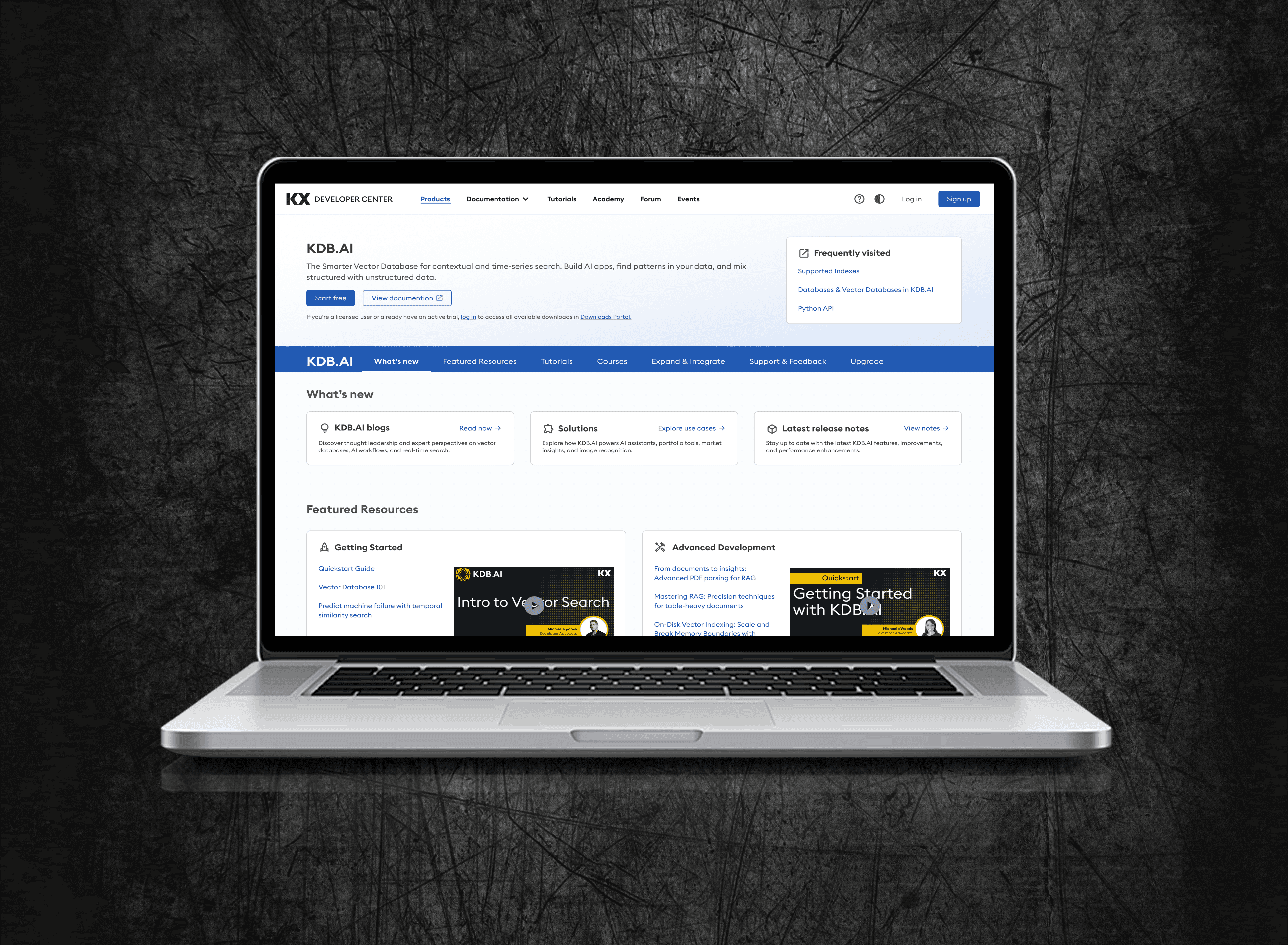
Before
An overcrowded left navigation forced users to guess where information lived.
An overcrowded left navigation forced users to guess where information lived.

After
Grouped and renamed sections improved clarity, with content nested under more intuitive categories

A/B Testing
To measure the impact of the new navigation, we ran an A/B test in Maze with 60 participants, comparing the redesigned layout with the original navigation. Participants were randomly assigned to reduce bias and completed 10 tasks across both versions.
📊 Metrics Measured:
Success rate
Time to completion
Misclicks
User confidence and feedback


🔥 Heatmap Insights
To better understand user behavior, we reviewed click heatmaps from Maze for both the original and redesigned navigation.
Before
Clicks were scattered, showing confusion about where to go.

After
Clicks followed a clear path, showing more confident navigation.

Reflection
What I Learned
What I Learned
This project was a significant milestone where I am proud to have successfully translated 150+ data points into a high-performing navigation system. Seeing my research directly result in measurable improvements to task success and time-on-task solidified my confidence in creating impactful user experiences.
#1
Validating navigation updates through card sorting and A/B experiments
#2
Linking qualitative findings with numerical data
#3
Evaluating design effectiveness via task success, completion time, and user feedback
#1
Validating navigation updates through card sorting and A/B experiments
#2
Linking qualitative findings with numerical data
#3
Evaluating design effectiveness via task success, completion time, and user feedback